NUS - RecycleLeague pilot
Live data visualisation for recycling competition
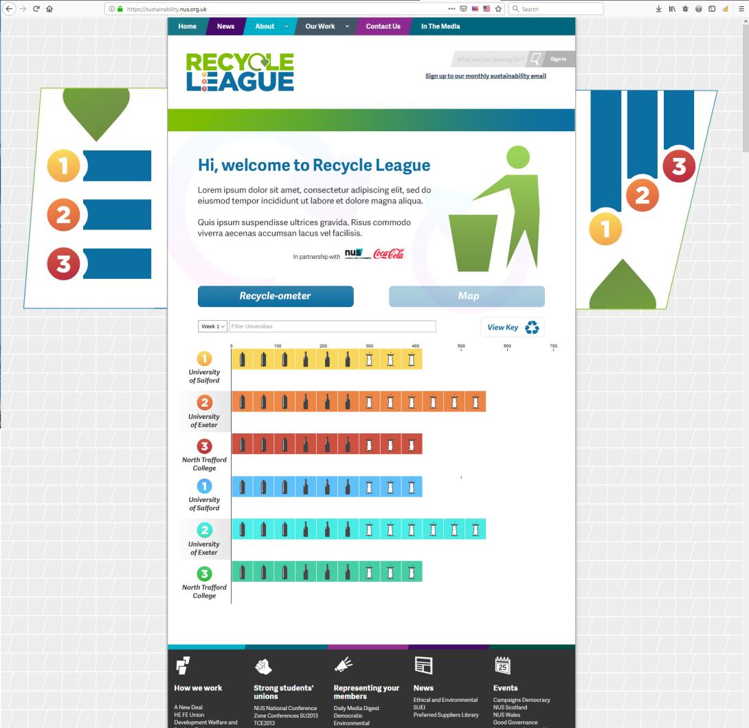
We built a data visualisation showing live weekly recycling rates of various competing universities and other institutions.
We powered this by taking an easy to update Google Spreadsheet and using the Google Sheets API to perform average, cumilative and other calculations.
We then displayed the data using HTML and CSS containers as bar charts rather than a complex framework to keep things lightweight and embedable.